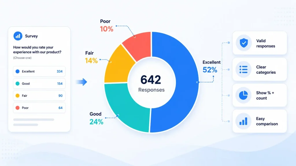
Survey reports often summarize responses as percentages. A result may show that 62 percent of participants selected one option, 24 percent selected another, and 14 percent chose a third.
These percentages are easier to scan than hundreds of individual responses, but the way they are visualized can affect how readers interpret them. A percentage chart generator can present the distribution clearly, provided that the chart also preserves important information about the question, response base, and category definitions.
Why Are Percentages Useful for Survey Results?
Raw response counts can be difficult to compare when surveys contain many participants or when different questions receive different numbers of answers.
Percentages convert the counts into a common scale. Readers can quickly see which option received the most support and how the remaining responses were distributed.
For example, a customer survey may ask respondents to rate a service as excellent, good, fair, or poor. Showing the percentage for each option provides a clearer overview than displaying several hundred individual records.
Percentages are also useful when comparing similar surveys with different sample sizes. A survey with 500 responses and another with 800 responses cannot be compared fairly using counts alone.
However, percentages should not be presented without context. A large percentage from a very small sample may be less reliable than a similar percentage based on many responses.
What Should a Survey Percentage Chart Communicate?
A useful survey chart should answer three basic questions:
- What question was asked?
- What proportion selected each response?
- How many valid responses were included?
The chart title should describe the question rather than using a vague label such as “Survey Results.” A clearer title might be “How Satisfied Are Customers with Delivery Speed?”
Each segment should represent one response category, and the categories should cover the complete set of valid answers included in the total.
The response base can be shown in a subtitle or note, such as “Based on 642 completed responses.” This helps readers understand the amount of data behind the percentages.
How Should You Prepare Survey Data for a Percentage Chart?
Survey data should be checked before it is converted into a visual summary. The following steps help ensure that the percentages represent the intended group of respondents.
Define the Response Base
Decide which responses belong in the calculation.
Some participants may skip the question, select “Not applicable,” or leave the survey before finishing. The report should clarify whether these records are excluded or shown as separate categories.
For example, if 1,000 people began the survey but only 720 answered a particular question, the percentages should normally be calculated from those 720 valid responses.
Using the full participant count as the denominator would make every response percentage appear smaller.
Check Whether Respondents Could Select Multiple Options
A single-choice question produces categories that normally add up to 100 percent. A multiple-choice question may not.
If respondents can select several options, the percentages represent the proportion of people selecting each answer rather than parts of one exclusive total. Adding those percentages may produce a result above 100 percent.
A pie or donut chart is usually inappropriate in that situation because the segments imply that all categories form one complete whole. A bar chart may communicate multiple-response data more accurately.
Keep Response Categories Distinct
Similar labels can confuse readers. Terms such as “Satisfied,” “Mostly satisfied,” and “Somewhat satisfied” should only be used together when each has a clear definition.
Categories should also remain in a logical order. Rating scales are usually arranged from positive to negative or from low to high rather than sorted randomly by segment size.
Review Rounding and Missing Data
Percentages should be calculated from the original counts rather than from previously rounded values.
Using whole percentages keeps labels simple, but the displayed total may equal 99 or 101 percent because of rounding. Adding one decimal place may help when the differences between categories are small.
Missing data should not be converted into zero responses unless the survey design defines it that way.
When Is a Donut Chart Suitable for Survey Data?
A donut chart generator works best for a single-choice question with a small number of clearly defined answers.
The open center can display the total number of responses or the leading percentage. For example, the center might show “642 responses,” while the surrounding segments display satisfaction levels.
This design is useful for simple questions such as preferred subscription plans, primary purchase reasons, or overall satisfaction ratings.
The format becomes less effective when the survey has many options. Narrow segments are difficult to compare, and long labels may not fit around the chart.
It is also not ideal when readers need to compare small differences precisely. A response of 23 percent can be difficult to distinguish visually from one of 25 percent. A sorted bar chart would make the difference clearer.
How Can a Circle Chart Maker Avoid Hiding Important Results?
A circle chart maker should not be used only because the result looks attractive. The layout must preserve the meaning of the survey.
Show all important response options, including neutral or negative results. Removing less favorable categories can make the distribution appear more positive than it actually is.
Avoid grouping meaningful responses into “Other” solely to simplify the chart. Grouping may be reasonable for many minor write-in answers, but it should not hide a category that affects the interpretation.
Labels should display the category name and percentage. When the sample is small, including the response count can provide additional context.
Use a consistent order for repeated survey questions. If satisfaction charts appear throughout one report, the same category should use the same position and visual treatment each time.
The title should not exaggerate the result. A chart showing 52 percent support should not be described as “Overwhelming Customer Approval.”
What Problems Can Make Survey Percentages Misleading?
One common problem is comparing percentages from different response bases without explaining the difference. A question answered by all participants should not be treated as directly equivalent to one answered by a small subgroup.
Another issue is combining categories after seeing the results. Merging “very satisfied” and “satisfied” may be reasonable, but the report should state that the categories were combined.
Survey wording can also influence responses. A visual chart cannot correct a leading, ambiguous, or incomplete question.
Small samples require particular care. If only ten people answered a question, one response represents ten percentage points. A chart may make the result look more stable than the underlying data supports.
Percentages also do not explain why participants selected an answer. Written comments, follow-up questions, or segment analysis may be needed to understand the reasons behind the distribution.
Present Survey Percentages with the Context Readers Need
A percentage chart can make survey results easier to understand by showing how responses are distributed across a complete set of options. It is most effective for clear, single-choice questions with a manageable number of categories.
The visualization should still show or explain the response base, skipped answers, rounding method, and category definitions. Multiple-choice questions and small differences may require a different chart format.
When the percentages are calculated correctly and the design preserves every important response, the finished chart can summarize survey results without hiding the details readers need to interpret them responsibly.
